Shimahara Visual is an architectural visualization studio with locations in Los Angeles and New York. For the last twenty years, Shimahara’s digital artists have been bringing unbuilt environments to life for architects and developers through artfully detailed renderings.
Client
Shimahara Visual
Studio
Flux Branding
Brand Guidelines, Collateral, Identity Design, Naming, Positioning, Print Production, Web Design, Web Development
The Objective
Shimahara sought a rebrand to mark a shift in focus: moving beyond illustration to film and motion. Shimahara needed a versatile identity to accommodate the growing studio and a website to showcase their beautiful portfolio.
 Portfolio Folder
Portfolio Folder
Portfolio Folder
 Portfolio Inserts
Portfolio Inserts
Portfolio Inserts
The Solution
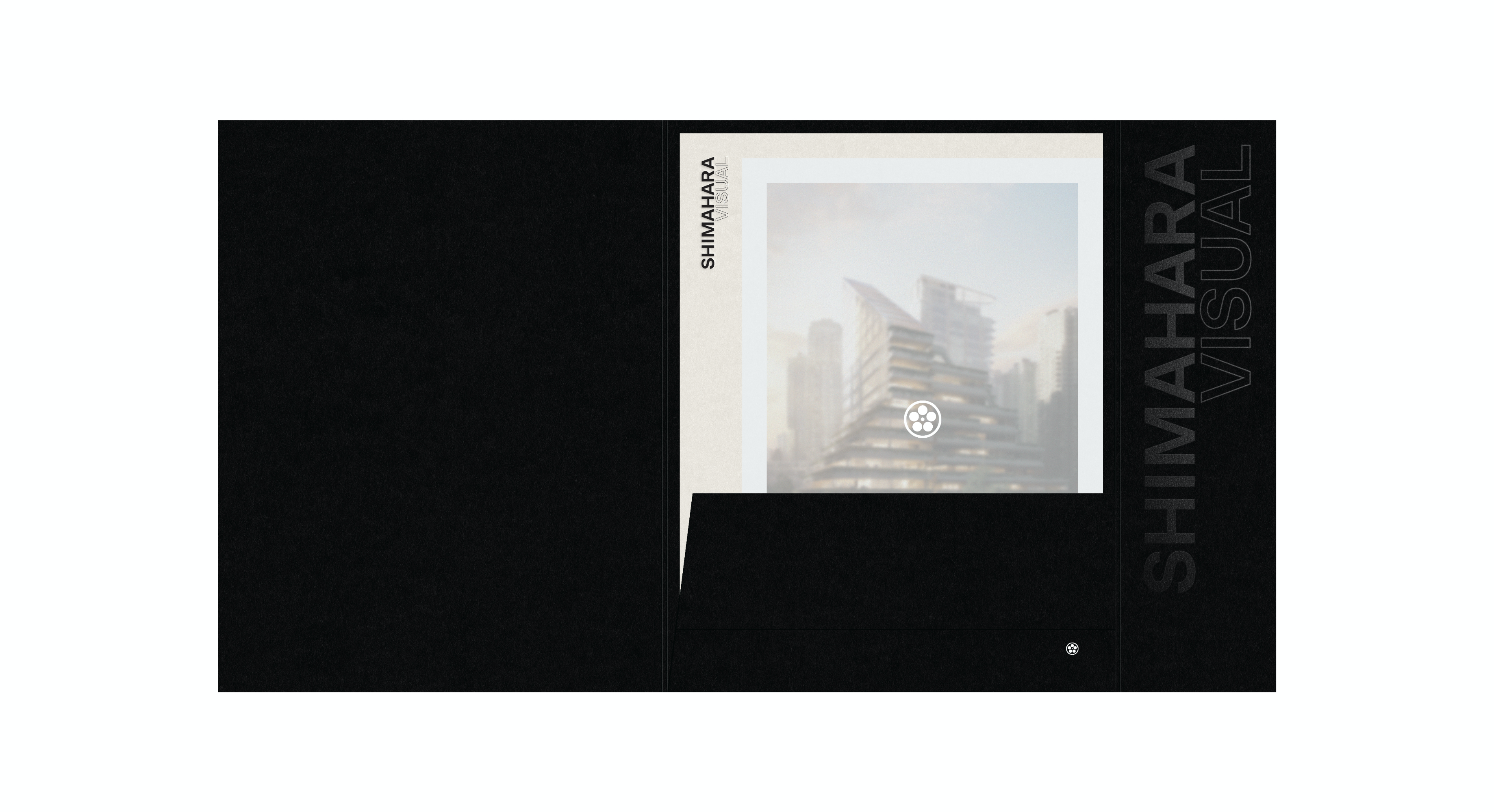
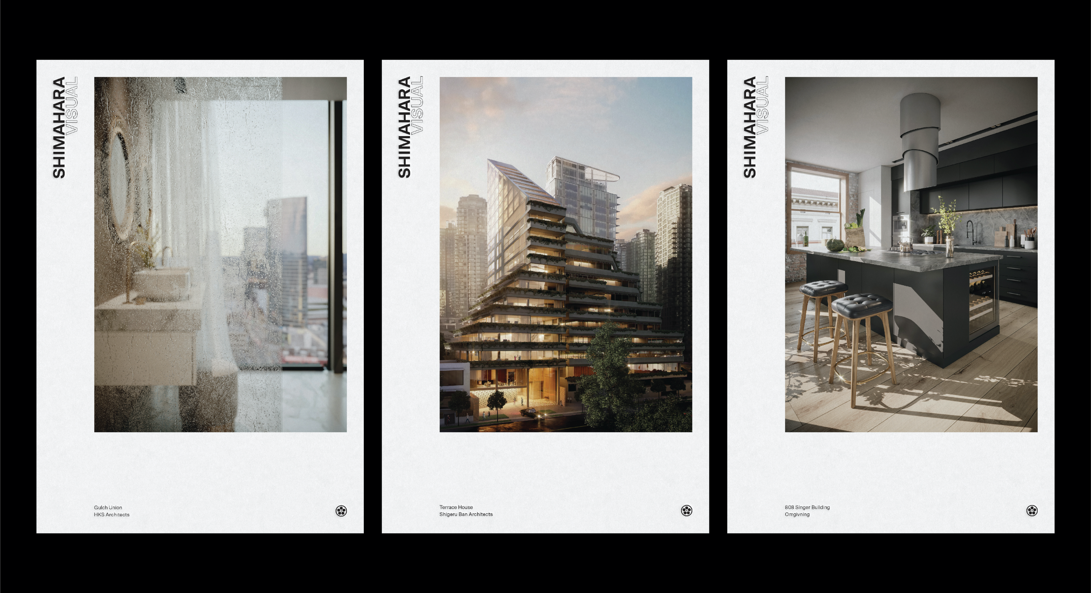
Shimahara Illustration was renamed to Shimahara Visual to encompass all of the studio’s capabilities. Inspired by the typographic marks and symbols found on camera equipment, the logotype honors the legacy of the founding namesake. The outlined type acts as a metaphor for what they do; visualizing what is not yet there. To reinforce Shimahara’s focus on moving images, the studio mon, a traditional Japanese emblem, abstractly represents a film reel. Their portfolio, both digital and print, is decidedly minimal, so as not to distract from the high level of artistry in the work.
 Website – Home
Website – Home
Website – Home